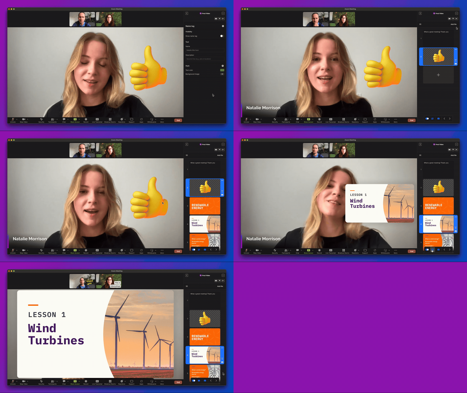

Prezi Video for Zoom lived entirely inside Zoom’s sidebar — a few hundred pixels of product space inside a platform we didn’t control.
The problem
Building inside someone else's house
Most people on a video call default to hiding behind a static slide deck: camera off, face nowhere near their content. Prezi Video offered the opposite — letting people appear alongside what they were presenting, without adding more work.
The catch was where it had to happen. Not on our own canvas, but inside Zoom’s meeting window, on Zoom’s release schedule, alongside Zoom’s own product teams. We were designing a real product while someone else controlled the space, the rules, and when we could ship.
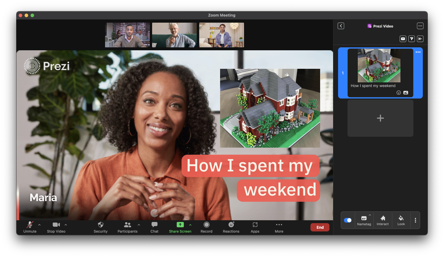
The catch was where that had to happen. Not on our own canvas, but inside Zoom's meeting window, on Zoom's release schedule, coordinated with Zoom's own product and roadmap teams. Working here meant designing a real product while someone else decided what could be shown, where, and when.
The process
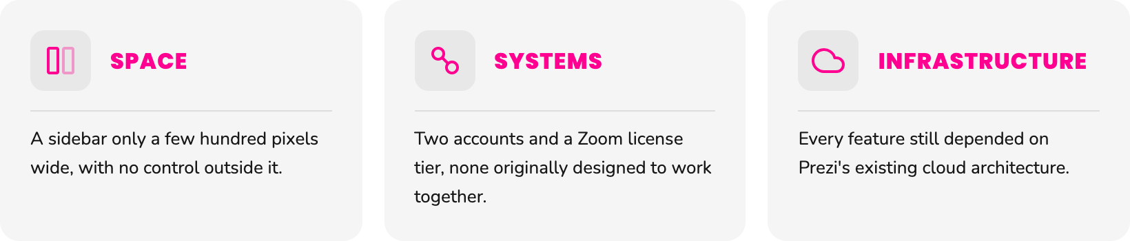
Three constraints shaped everything
The solution we chose not to ship
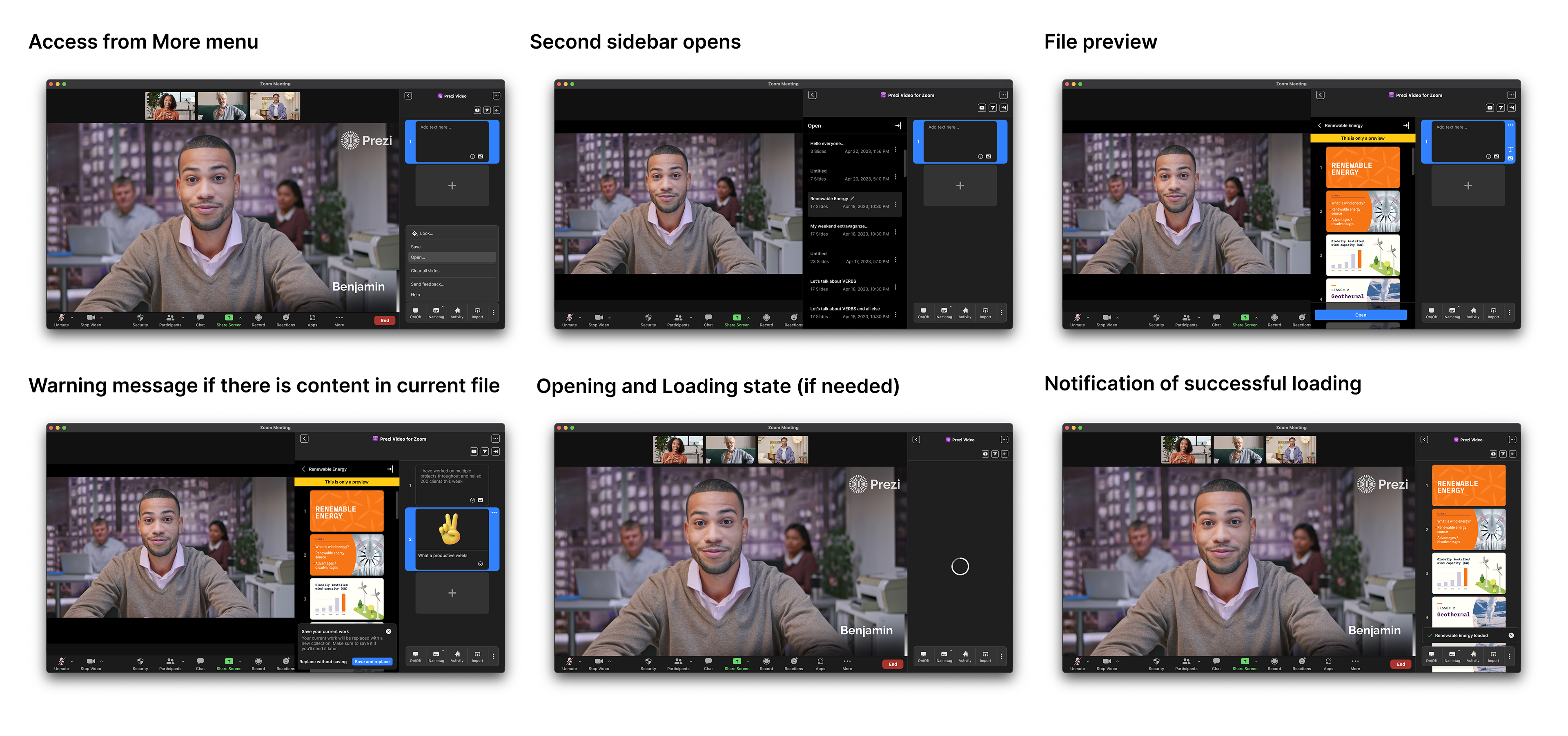
Our first approach to file management was a dedicated second sidebar: a place to browse, preview, save, and delete presentations.
In testing, it took valuable space away from the camera view — the very thing the app existed to protect. File handling became more spacious, but the core experience became worse.
The work is shown here because rejecting a well-designed, fully tested solution was itself an important product decision. Staying visible on camera mattered more than preserving an interface we had already invested in.

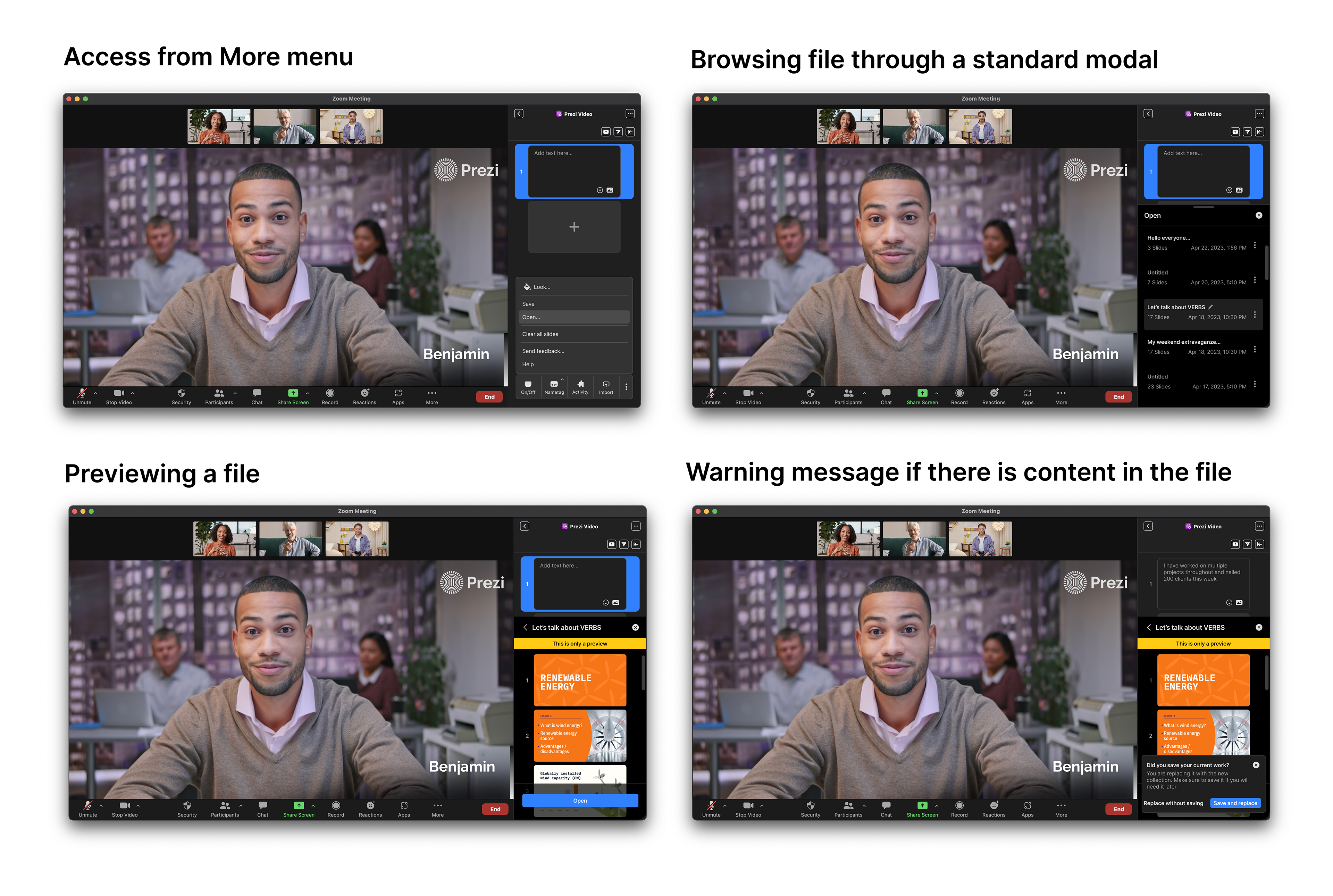
Keep the capability, lose the extra UI
Removing the second sidebar didn't remove the need to save. Users wanted content from one meeting to carry into the next rather than disappear when the call ended.
We kept saving inside the single sidebar, turning a transient meeting tool into something users could build on from meeting to meeting.
The design system
Designing the system, not the screen
Every new feature could have become another one-off interaction. Instead, we treated the toolbar, notifications, and file handling as a shared product system.
The toolbar, versioned
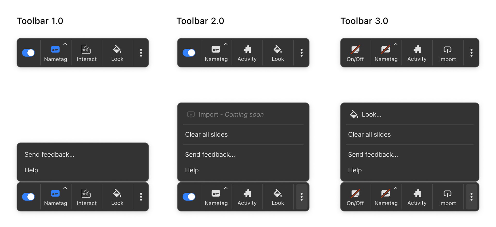
Toolbar 2.0 introduced Nametag, Activity, and Look with a More menu. Toolbar 3.0 pushed further: Import moved onto the main bar, Look moved into overflow, and content visibility became an explicit On/Off state with independent on, off, and mixed states for content and nametag.
Notifications, as a matrix.
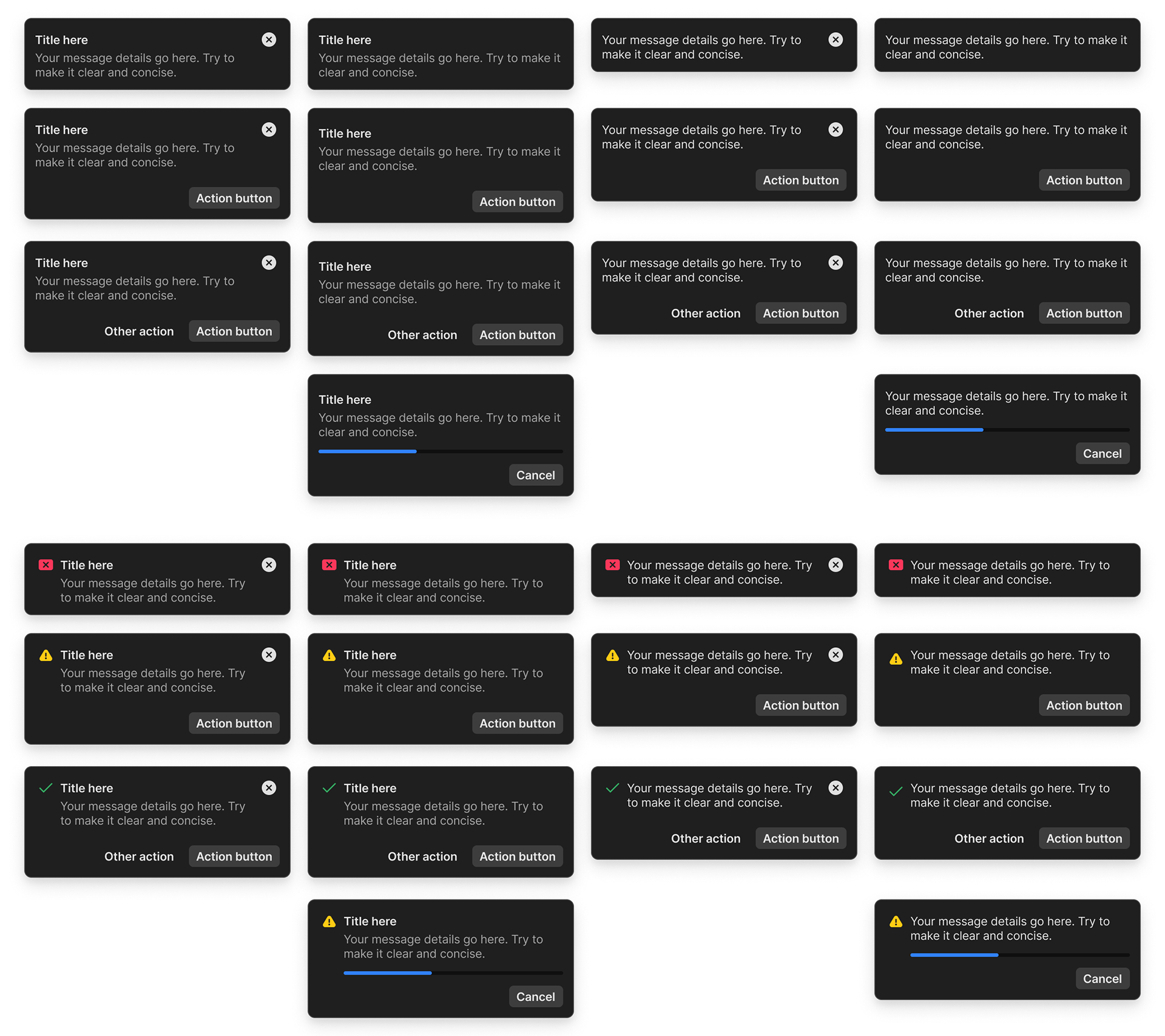
Dismissible or persistent, with or without a title, with or without an icon. One component designed to cover the product’s notification states instead of creating a new pattern every time one appeared.
Designing for engagement
Visibility got people in. Participation gave them a reason to stay.
Research consistently pointed beyond simply being seen on camera. What mattered in meetings was participation.
Inside Zoom, that mattered even more: Prezi wasn't competing for attention inside its own product. It was competing for a moment of attention inside someone else's meeting.
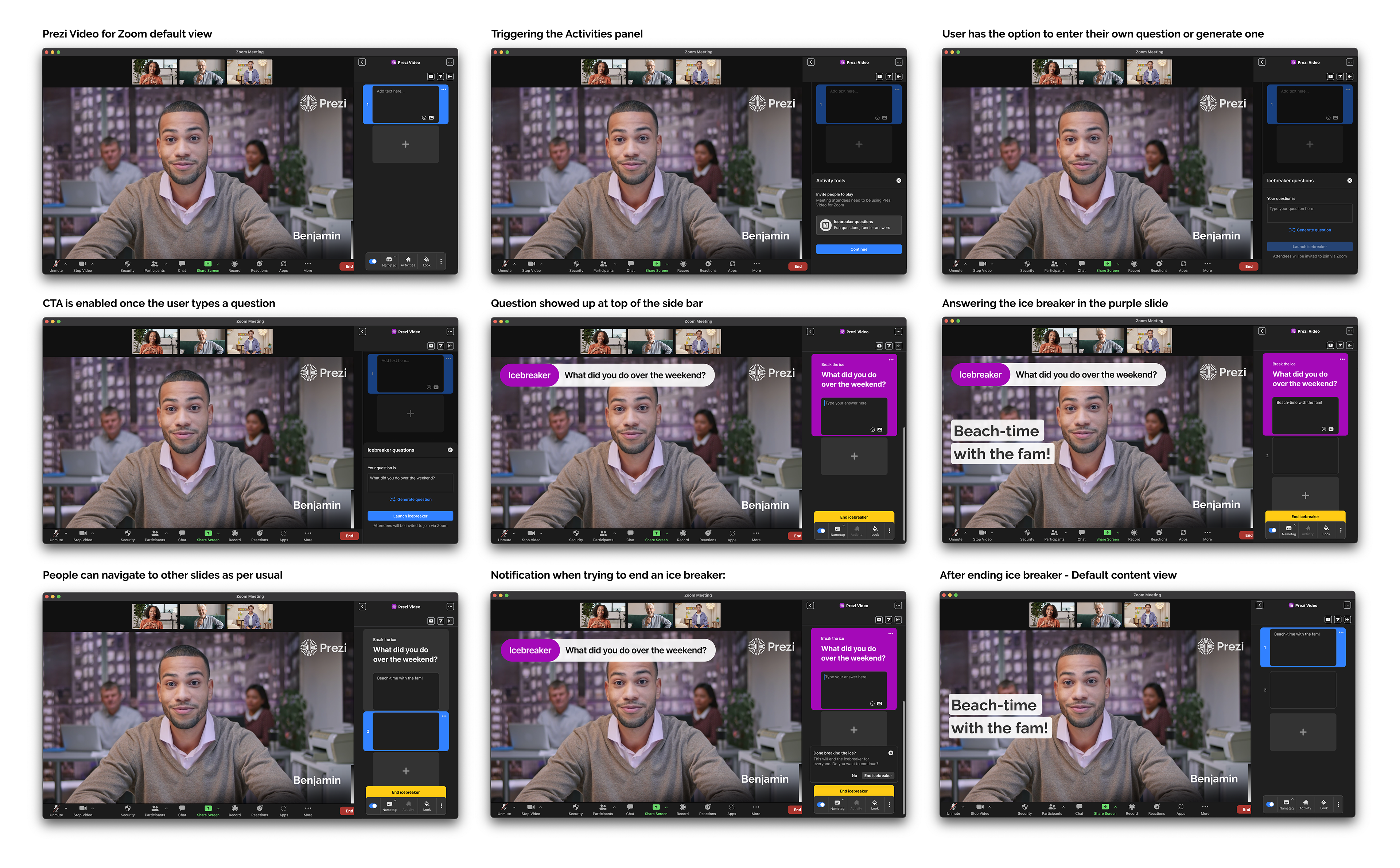
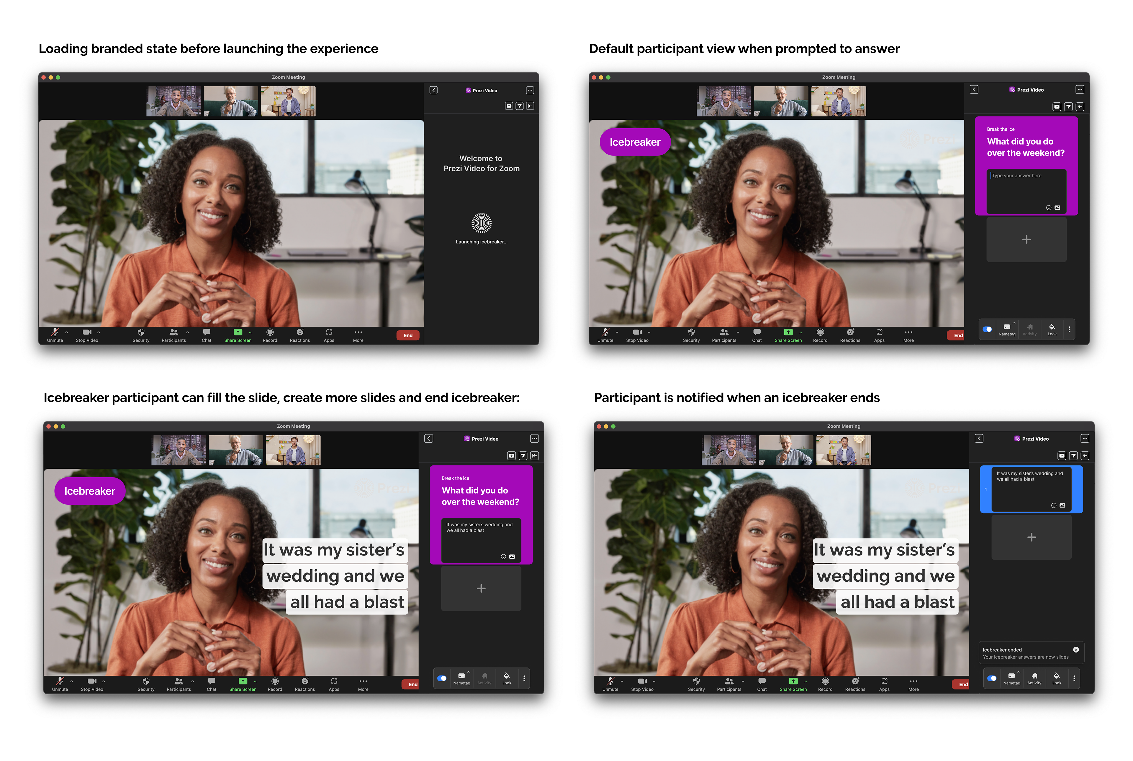
Icebreaker turned that insight into a feature. A facilitator could launch a prompt, participants answered directly in their own Prezi slide, and the meeting moved on without leaving Zoom.
Icebreaker turned that insight into a feature. A facilitator could launch a prompt, participants answered directly in their own Prezi slide, and the meeting moved on without leaving Zoom.
Ice-breaker feature flow, facilitator experience
Product goal: Turn mid-meeting curiosity into engagement, repeat use, and eventually conversion.
Ice-breaker feature flow, participant experience
The edge cases
The happy path was the easy part
The main flows were straightforward. The real work was everywhere they broke: camera permissions disabled in Zoom, oversized uploads, failed saves, interrupted sessions.
Working through these states with product and engineering meant designing responses for each condition rather than relying on one generic error pattern.
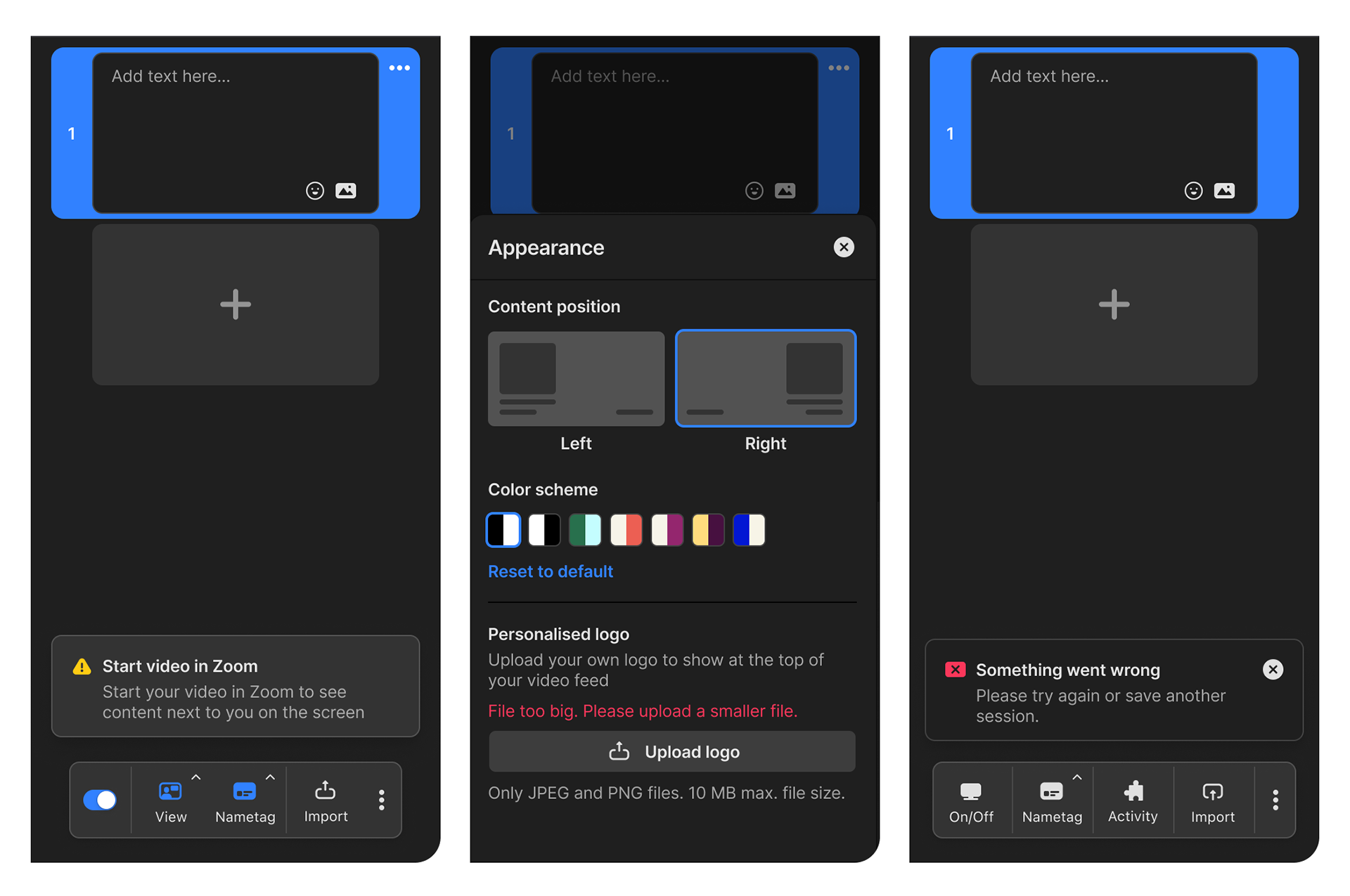
Permission, validation, and system failure edge cases
Monetization
One product, two paywalls
Monetization wasn't a simple free-to-paid funnel. To reach Prezi's paid tier, users first had to clear Zoom's own licensing gate.
That meant our free experience needed to create enough value to justify upgrading through two separate products — while pricing and access rules remained partly outside our control.

Zoom partnership constraint: Features and release timing were also coordinated with Zoom's product and roadmap teams.
What I'd do differently now
In hindsight, I'd focus earlier on business users. Research consistently pointed to them as the audience most likely to convert, and features such as brand kits and deeper customization deserved more attention than they received.
The project also reinforced something I've carried into later work: in platform products, interaction design is shaped as much by infrastructure, permissions, and commercial constraints as by what appears on screen.