Role: Lead Designer
Team: PM, engineers, UX research, marketing, partnership team
Platform: Zoom App Marketplace (sidebar panel)
Status: Shipped, live in Marketplace
Company: Prezi
Team: PM, engineers, UX research, marketing, partnership team
Platform: Zoom App Marketplace (sidebar panel)
Status: Shipped, live in Marketplace
Company: Prezi
Building inside someone else's house
Most people on a video call default to hiding behind a static slide deck, camera off, face nowhere near their content. This app existed because people wanted the opposite: to show up on screen, next to what they were presenting, without it feeling like extra work.
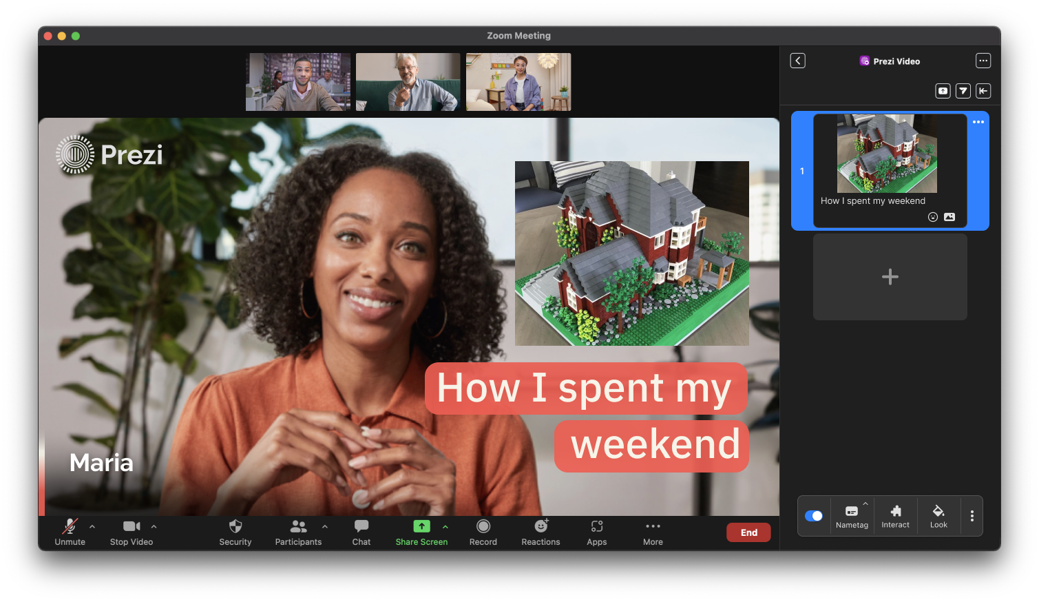
The catch was where that had to happen. Not on our own canvas, but inside Zoom's meeting window, on Zoom's release schedule, coordinated with Zoom's own product and roadmap teams. Working here meant designing a real product while someone else decided what could be shown, where, and when.
Three walls, one canvas
Space
A sidebar a few hundred pixels wide, no control over anything outside it.
A sidebar a few hundred pixels wide, no control over anything outside it.
Systems
A Prezi account, a Zoom account, and a Zoom license tier, none of them originally built to talk to each other.
A Prezi account, a Zoom account, and a Zoom license tier, none of them originally built to talk to each other.
Infrastructure
Every feature ultimately bound by Prezi's own cloud engine.
Every feature ultimately bound by Prezi's own cloud engine.
What we tested, and let go
The first instinct for file management was a dedicated second sidebar, its own space to browse, preview, save, and delete. In testing, it took real estate directly from the camera view, the one thing this app existed to protect. That traded away the core value of the product to make file handling more spacious. It didn't survive testing.
It's shown here because rejecting well-designed, fully tested work is its own kind of decision, staying visible on camera was the entire point of the app, so anything that competed with that couldn't stay, no matter how far the interaction itself had been refined.
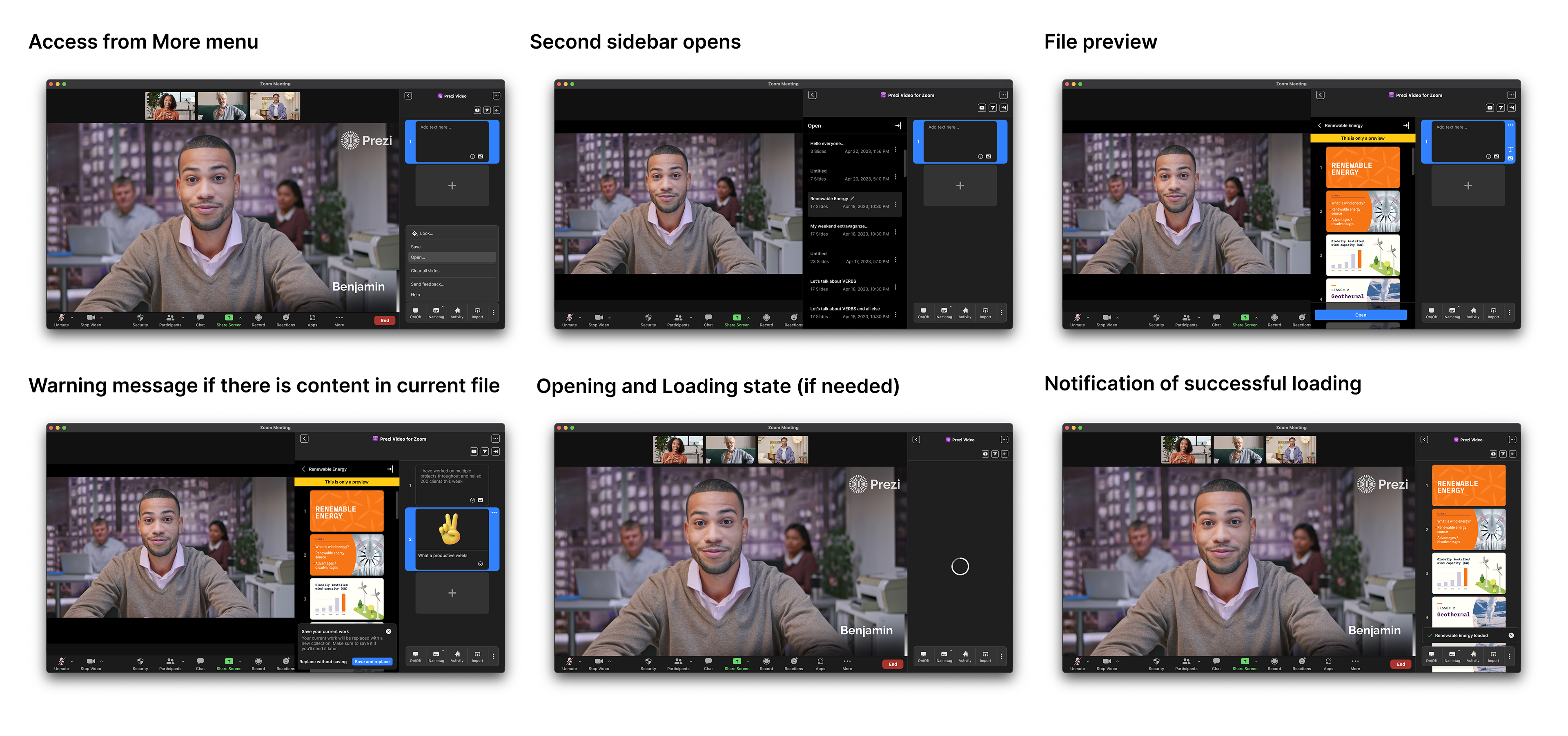
Saving, shipped inside the one sidebar that stayed
Without the second sidebar, saving still had to exist somewhere. Users were explicit about needing it: content from one meeting needed to carry into the next, rather than disappearing the moment the call ended. Saving shipped inside the single sidebar instead, turning what had been transient, meeting-only content into something people could build on meeting after meeting.
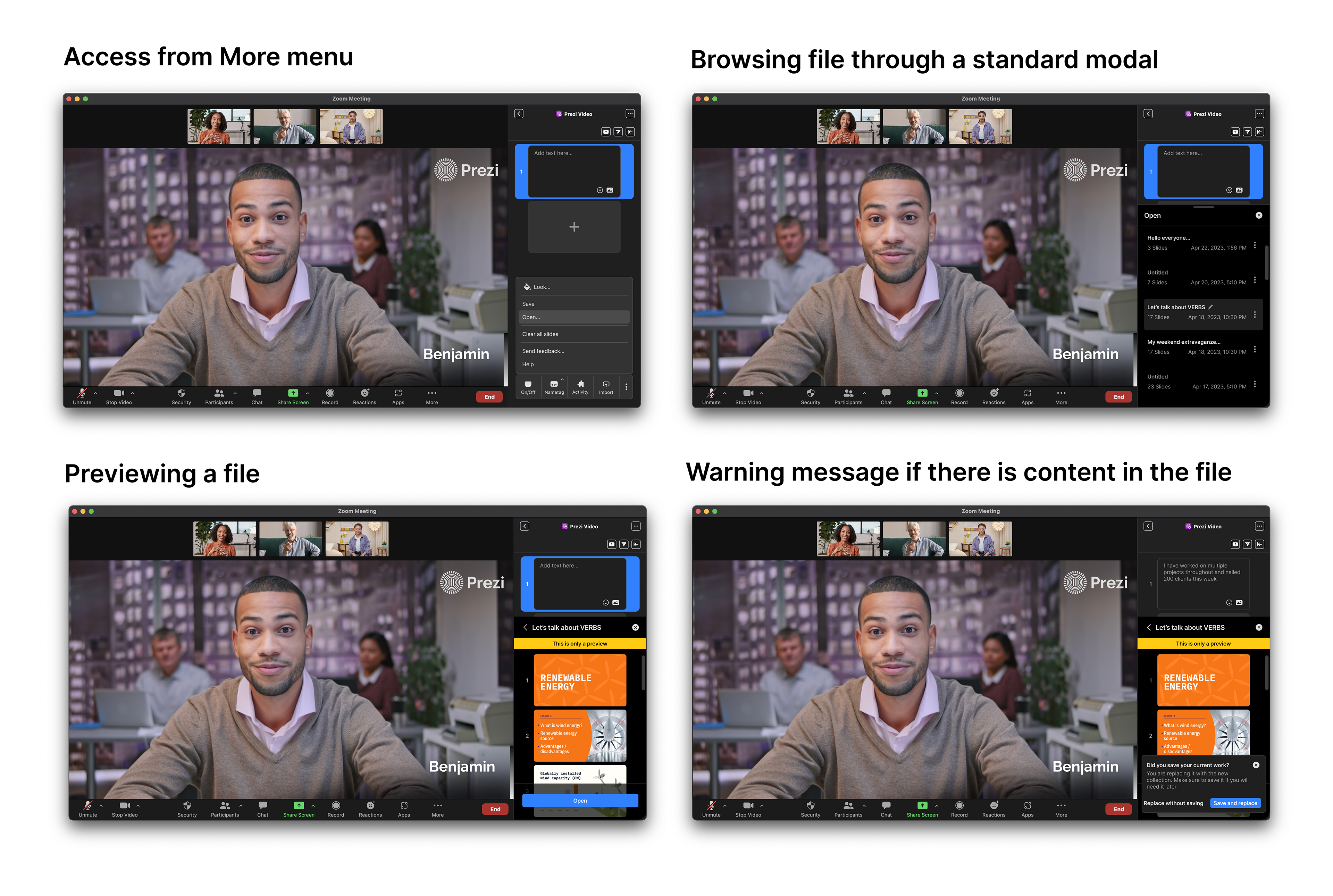
Designing the system, not the screen
Every new feature could have shipped as its own bespoke screen. Instead, the toolbar, notifications, and file handling were treated as a shared system.
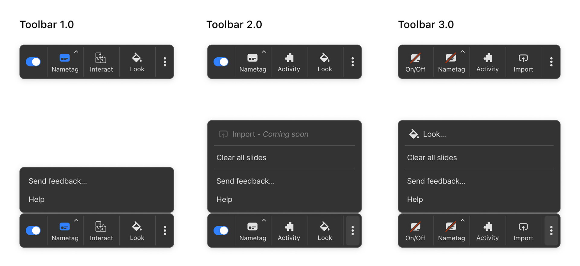
The toolbar, versioned
Toolbar 2.0 introduced Nametag, Activity, and Look with a More menu. Toolbar 3.0 pushed further: Import moved onto the main bar, Look moved into overflow, and content visibility became an explicit On/Off state with independent on, off, and mixed states for content and nametag.
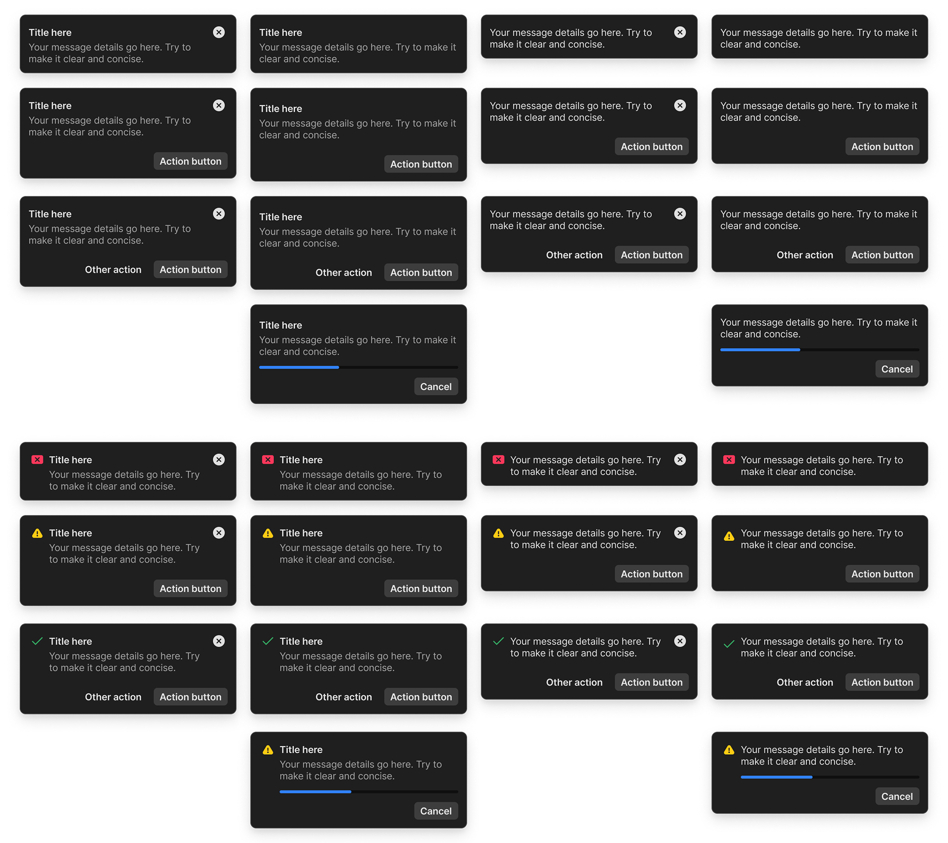
Notifications, as a matrix.
Dismissible or persistent, with or without a title, with or without an icon. One component built to answer every notification need the product would ever have, not a new design each time one came up.
Where engagement actually came from
Research kept pointing at the same thing: what people cared about most in these meetings was engagement, not just being seen, but participating. Being inside the Zoom Marketplace made that especially direct, this wasn't a feature competing for attention inside Prezi's own product, it was competing for a moment of attention inside someone else's meeting.
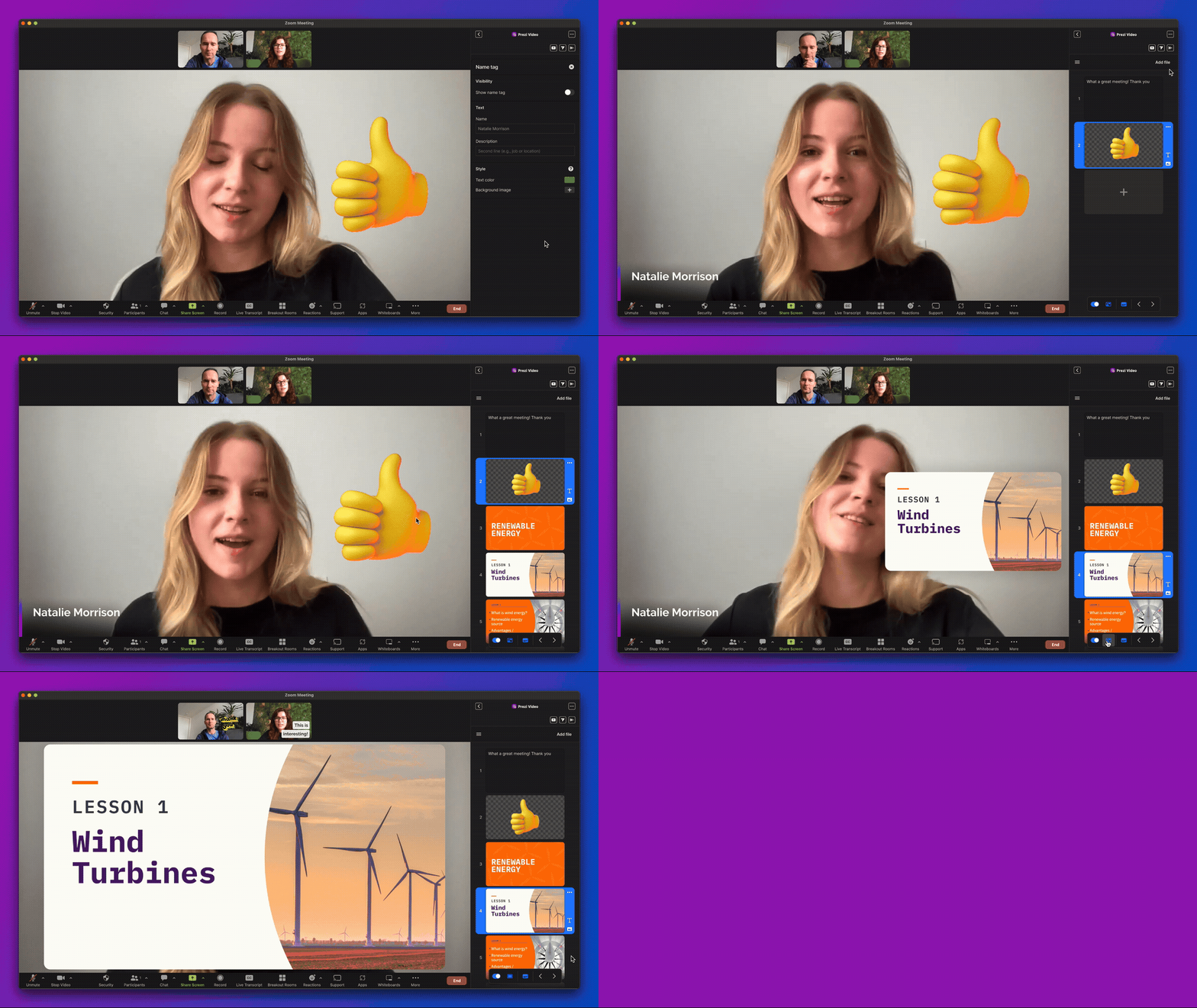
The icebreaker feature answered that directly. A facilitator launches a prompt, it appears at the top of the sidebar for everyone, participants answer in their own purple slide, and the facilitator can end it and move on. Fully shipped, fully tested, and it worked toward the same underlying goal the whole app was built around: converting people who showed up out of curiosity into people who kept coming back, and eventually into paying users.
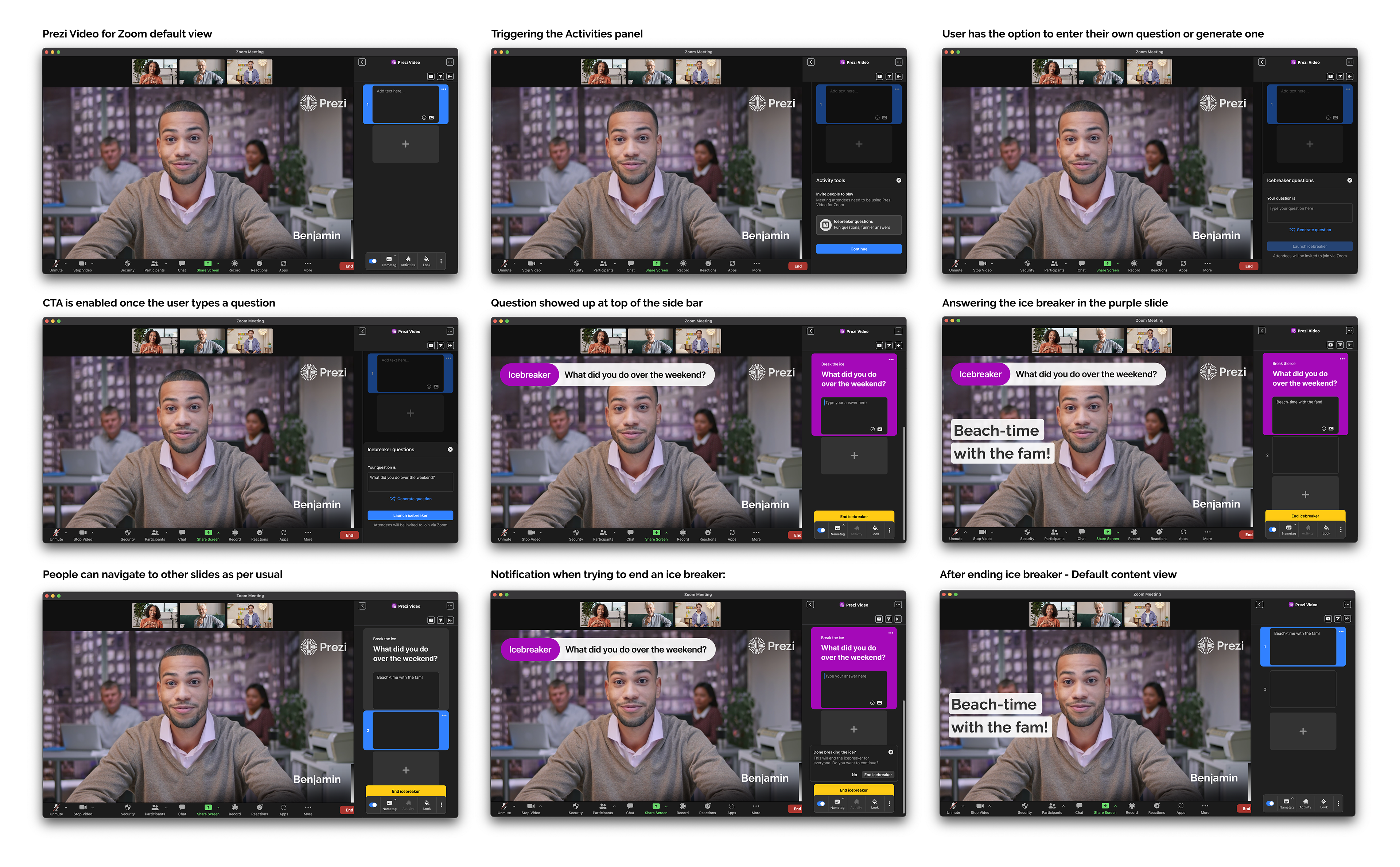
Ice-breaker feature flow, facilitator experience
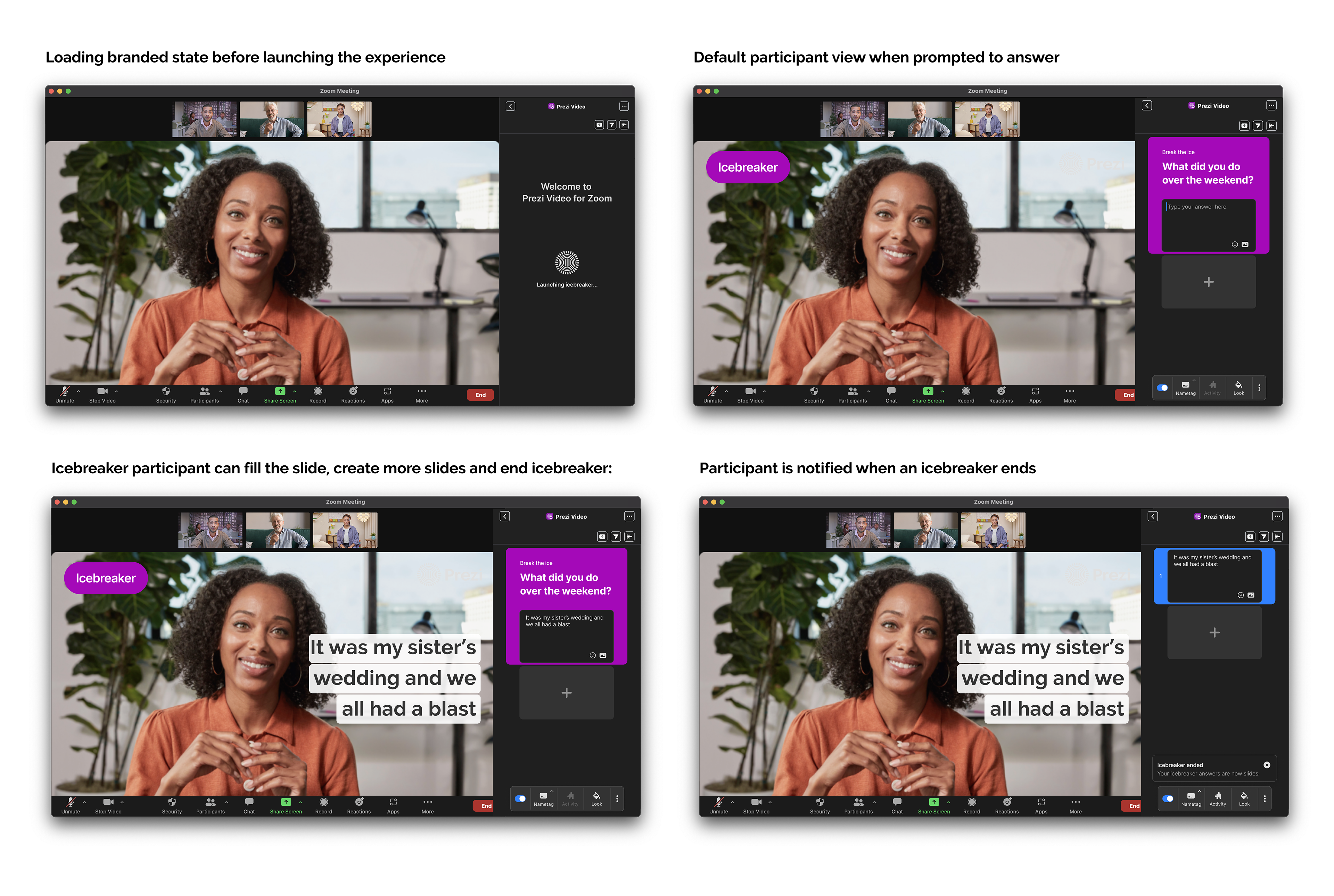
Ice-breaker feature flow, participant experience
Designing the edge cases
Every flow gets mapped clean the first time through. The real work is everywhere it doesn't go as planned, camera permissions not yet enabled in Zoom, a file too large to upload, a save that fails mid-session. Working through these with stakeholders meant designing a real response for each one, not just a generic error message standing in for all of them.
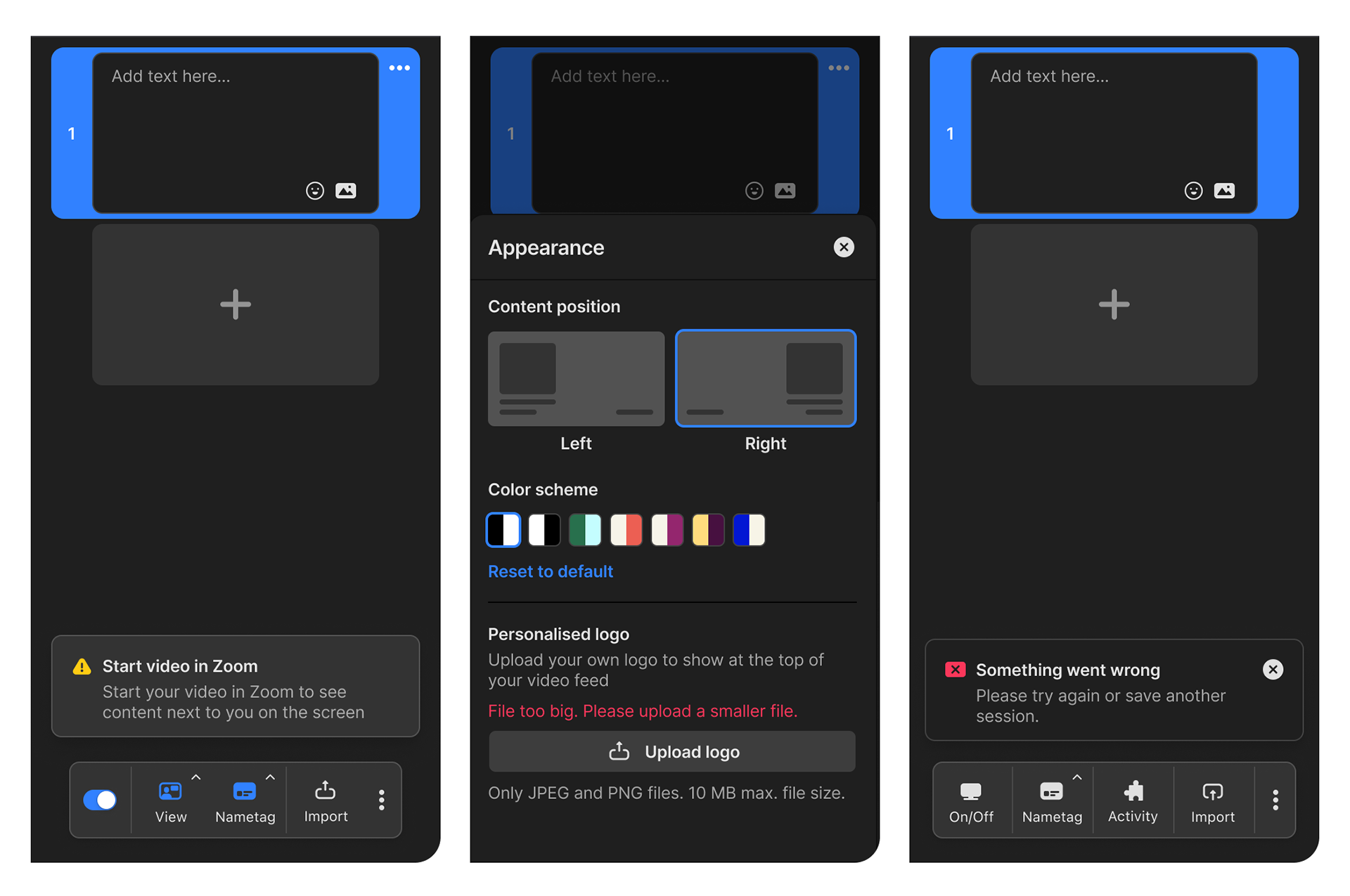
Why it was harder than it looked
Monetization here wasn't a single free-versus-paid line, it was two gates stacked on top of each other. To unlock Prezi's paid tier at all, someone first had to be a paid Zoom user, Prezi's monetization was tied directly into Zoom's own licensing model, not something we could design or price independently. That meant the free experience had to work as a genuinely logged-out state with real constraints, watermark visible, limited sessions, no templates, while still feeling worth upgrading past two separate paywalls, not one.
On top of that, this was a live collaboration with Zoom's own product and roadmap teams. Features, timing, and what could be surfaced in the sidebar were shaped by Zoom's priorities as much as ours. Working well here meant designing a coherent product while someone else held real control over the environment it lived in.
What we were aiming for
Converting people who opened the sidebar out of curiosity mid-meeting into people who engaged, came back, and eventually upgraded, inside a monetization structure that wasn't fully ours to design.
What I'd do differently now
This project pushed me to design well past visuals, working through real infrastructure and platform constraints taught me how much interaction design depends on what's happening underneath the screen, not just what's on it. It also sharpened how I think about engagement, how to make a routine meeting feel worth showing up for, and how to convert people by giving them something they didn't know they needed. In hindsight, I'd have leaned into business users earlier. Research kept pointing to them as the audience most likely to convert, and features like brand kits and deeper customization deserved more of our focus than they got.