
Role: Lead Designer
Team: PM, engineers. UX research, Data
Platform: Native desktop app, Mac and Windows
Scope: Concept through shipped MVP
Company: Prezi
Team: PM, engineers. UX research, Data
Platform: Native desktop app, Mac and Windows
Scope: Concept through shipped MVP
Company: Prezi
Context
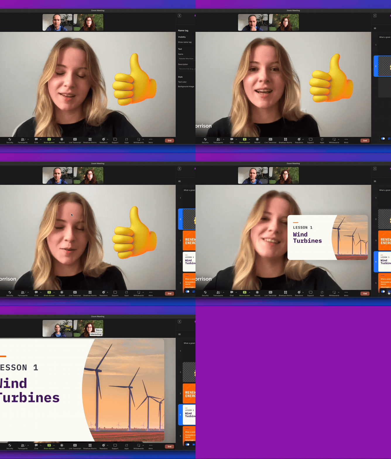
Camera overlay lets someone appear on screen, live, next to their own content while presenting or recording. It's a live camera feed layered on top of the presentation, positionable anywhere on screen, that stays visible through screen sharing or recording, instead of the presenter hiding behind a static slide deck or a plain screen share.

The Opportunity
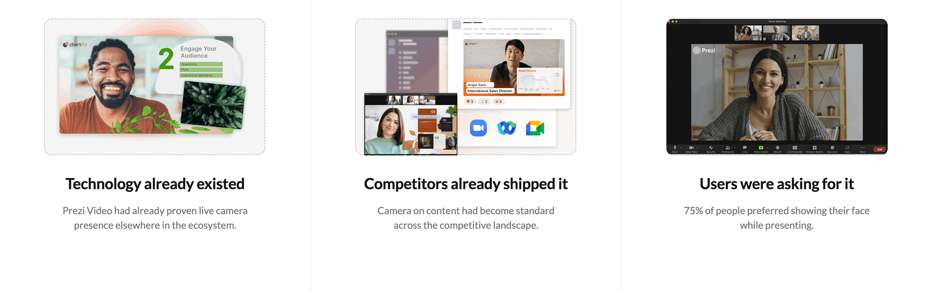
Three signals pointed the same direction, which is worth laying out as three columns rather than one paragraph:
The problem
Presenting live is already high stakes. If turning the camera on takes even one extra step, people skip it and default back to hiding behind a plain screen share.
"Ninety seconds before a client call, there's no time to open a settings dialog, choose a camera shape, and decide where an overlay should sit. There's only time to hit one button and be on screen, put together, before anyone joins."
What we tried first, and discarded
The first version was a full setup dialog: pick your camera, choose a camera shape, choose where it sits on screen, confirm with OK. It was thorough, and it also added a modal and an extra click between "I want to show my face" and actually being on screen.
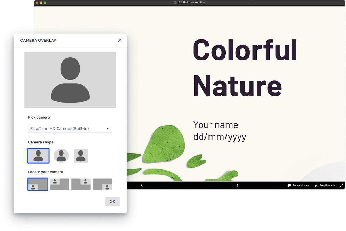
The UI approach before user testing and stakeholder alignment
User testing surfaced the friction directly. People wanted a fast way to turn the camera on, and the setup dialog was in the way of that. So we cut it. The final MVP replaced the dialog with a single button in the bottom bar, camera off by default, one click to turn it on, with positioning handled afterward by simply dragging the overlay to wherever it needed to sit on the canvas.
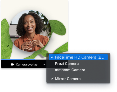
Final UI approach

Mapping the whole interaction
Once the single button replaced the dialog, the real work moved underneath it. Every state the old dialog used to handle explicitly, permissions, first-time guidance, loading, repositioning, still had to exist somewhere, now working quietly with native camera and OS level permission systems instead of a form the user filled in themselves. The goal throughout was to keep the presenter's intent front and center: someone opening this is trying to present, not configure software, so the flow needed to handle every one of these states without ever pulling focus away from the actual presentation on screen.
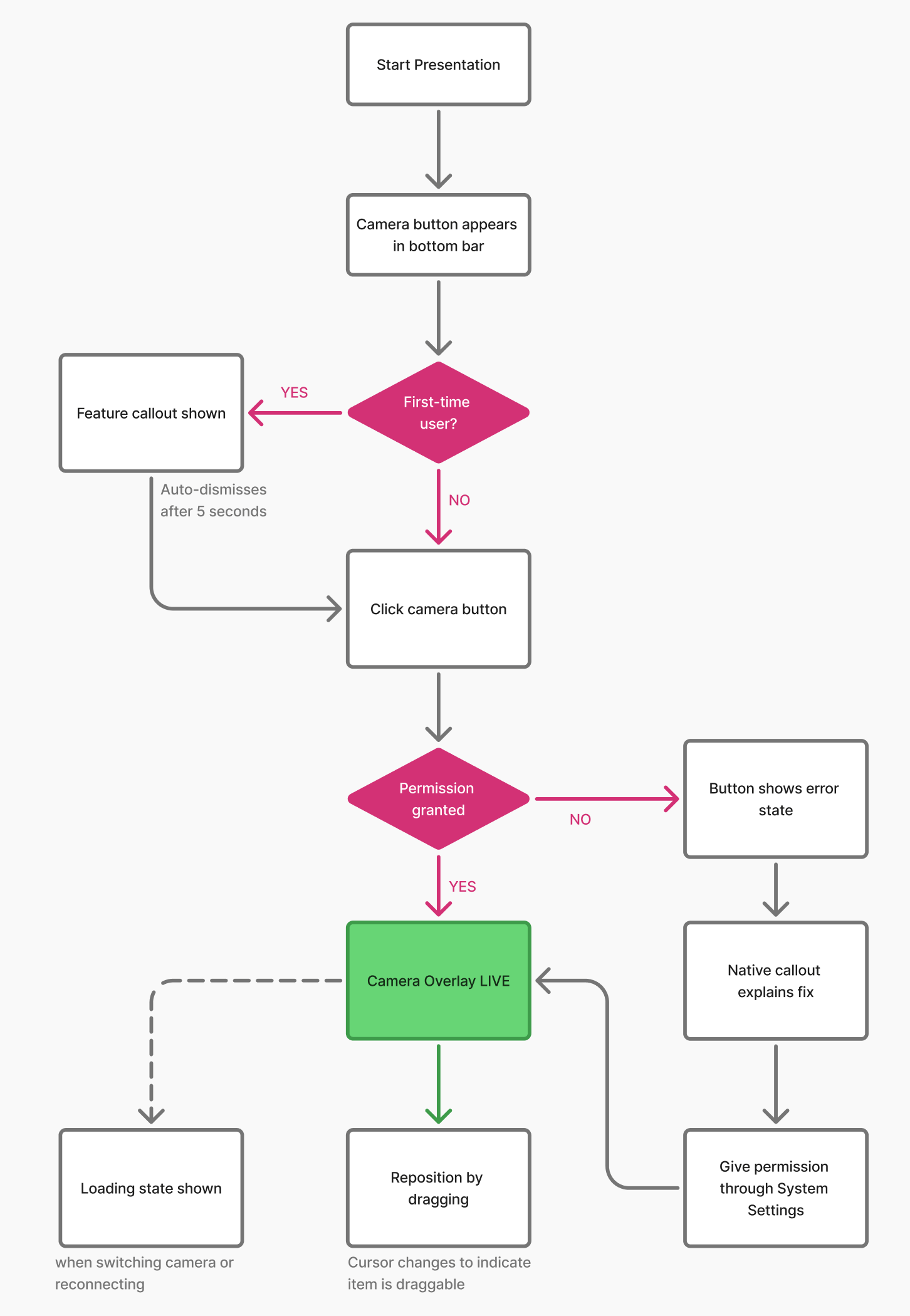
Designing the edge cases
Removing the dialog meant the permission and configuration logic that used to live inside it had to be handled elsewhere, quietly, without turning a one click action into a maze.
Permission denied
If someone declined camera access, the button itself shifted into a visible error state, with a native callout explaining how to fix it manually rather than leaving them stuck with no explanation.
If someone declined camera access, the button itself shifted into a visible error state, with a native callout explaining how to fix it manually rather than leaving them stuck with no explanation.
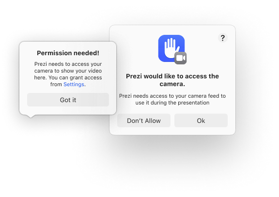
First-time users only
A feature callout introduces the new button once, then disappears, so returning users aren't repeatedly interrupted by an explanation they no longer need.
A feature callout introduces the new button once, then disappears, so returning users aren't repeatedly interrupted by an explanation they no longer need.
Platform divergence, hidden behind identical UI
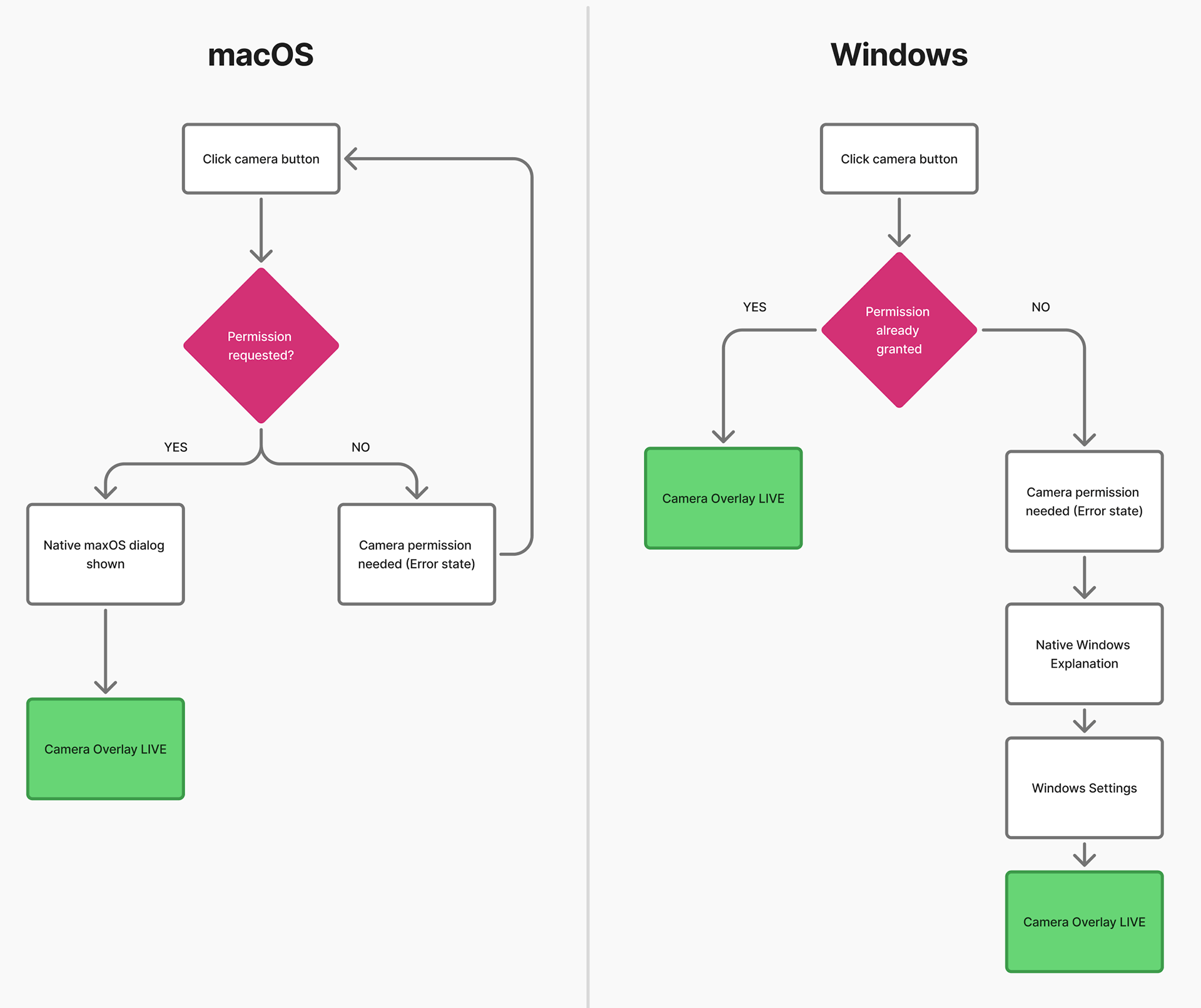
Mac and Windows show nearly the same interface, but the permission model underneath is different. Windows grants all apps camera access by default, so most Windows users never see a permission prompt at all in the happy path, while Mac requires an explicit native permission dialog before the camera can turn on. Same button, different underlying logic depending on the OS.
Mac and Windows show nearly the same interface, but the permission model underneath is different. Windows grants all apps camera access by default, so most Windows users never see a permission prompt at all in the happy path, while Mac requires an explicit native permission dialog before the camera can turn on. Same button, different underlying logic depending on the OS.
What made this harder than it looks
Zooming out from the interaction details above, two things made this a genuinely harder problem than a single button suggests. The camera and recording engine sat on legacy technology that wasn't originally built with a one-click, no-dialog interaction in mind, so removing the setup dialog meant finding new places for logic that used to live inside it, rather than just deleting a screen. On top of that, the underlying permission and camera handling differed enough between macOS and Windows that "one button" on the surface meant two genuinely different implementations underneath, not a single shared solution reskinned twice.
Goal
This work targeted our most loyal, highest-paying desktop users. For that segment, matching what competitors already offered wasn't optional, it was necessary to prevent churn to tools that already had this built in. The target was straightforward: more people turning the camera on, and more of them sticking with it.
What came next
This feature's direction fed directly into a larger initiative: bringing the same camera presence into a full recording studio, accessible right from the presentation editor. The camera overlay carried over as is, now sitting inside a fuller set of recording controls, letting someone navigate their presentation and record it live, on camera, from within the same editing surface. This wasn't a dead end, it became the foundation for the next feature I worked on. The recording studio on the Prezi native app became one of the features I'm proudest of from the Native app team. Read more about it in this dedicated support article.

The next feature was designing the recording studio on Prezi native app
Reflection
This project taught me a lot about working with complex native technologies, managing stakeholders under pressure, and finding ways to leverage legacy infrastructure rather than fight it. In hindsight, I would have loved the time to design and test a more ambitious version of camera control, one where the camera did not just sit as a fixed overlay on top of the presentation, but moved, scaled, and repositioned itself in relation to whatever point the presenter was making, becoming an integrated part of the presentation rather than a surface layered on top of it. That direction was not realistic here: the underlying product carried real legacy complexity, and the pressure from stakeholders to ship something reliable and fast meant the priority had to be a simple, solid version now rather than building toward that longer term vision. Given more room, that is the direction I would push toward next.